Giancarlo Tosoni
ABOUT
Graphic designer and art director with 15+ years building brand identity systems across corporate, product and cultural projects. I operate at every altitude of a branding program, from strategic positioning and naming through visual identity, custom typography and production-ready rollout.
Graphic designer and art director with 15+ years building brand identity systems across corporate, product and cultural projects. I operate at every altitude of a branding program, from strategic positioning and naming through visual identity, custom typography and production-ready rollout.
AWARDS
Work recognized by international institutions including Red Dot, ADI Design Index, Graphis and the Italian Art Directors Club across brand identity, editorial design and custom typography.
Work recognized by international institutions including Red Dot, ADI Design Index, Graphis and the Italian Art Directors Club across brand identity, editorial design and custom typography.
Giancarlo Tosoni
ABOUT
Graphic designer and art director with 15+ years building brand identity systems across corporate, product and cultural projects. I operate at every altitude of a branding program, from strategic positioning and naming through visual identity, custom typography and production-ready rollout.
AWARDS
Work recognized by international institutions including Red Dot, ADI Design Index, Graphis and the Italian Art Directors Club across brand identity, editorial design and custom typography.
CONTACT
I was going to be a doctor, not a designer
Second year of medical school, I walked into a bookstore near campus and found "The Art of Looking Sideways" by Alan Fletcher. I didn't know what graphic design was, but I kept turning pages because the visual logic in that book felt completely different from the textbooks I was used to. I was already questioning whether medicine was right for me, and that book made design feel like something I could actually do. I left that semester and enrolled in design school.
Second year of medical school, I walked into a bookstore near campus and found "The Art of Looking Sideways" by Alan Fletcher. I didn't know what graphic design was, but I kept turning pages because the visual logic in that book felt completely different from the textbooks I was used to. I was already questioning whether medicine was right for me, and that book made design feel like something I could actually do. I left that semester and enrolled in design school.
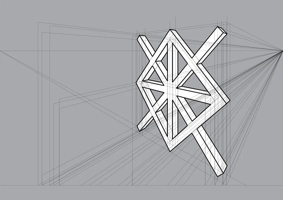
Where brand identity started for me
Design school treated creativity almost like a talent you're born with, the kind that either comes or doesn't. My mind never worked that way, and for a while that was frustrating. Then I took a brand identity course where research, competitive analysis and strategy came before anything visual, and for the first time the way a project could be approached matched how I naturally think. That's when branding became the discipline I wanted to go deeper into.
Design school treated creativity almost like a talent you're born with, the kind that either comes or doesn't. My mind never worked that way, and for a while that was frustrating. Then I took a brand identity course where research, competitive analysis and strategy came before anything visual, and for the first time the way a project could be approached matched how I naturally think. That's when branding became the discipline I wanted to go deeper into.
Fifteen years inside a brand consultancy
In 2009 I joined Univisual, a Milan consultancy specialised in corporate identity. Their vertical focus gave me something harder to find in most studios: the chance to work across every phase of the process, from brand strategy and naming through visual identity and rollout. That consistent depth across projects is what built my multi-layered approach to brand development, but it also taught me that knowing the craft is only half of the job.
In 2009 I joined Univisual, a Milan consultancy specialised in corporate identity. Their vertical focus gave me something harder to find in most studios: the chance to work across every phase of the process, from brand strategy and naming through visual identity and rollout. That consistent depth across projects is what built my multi-layered approach to brand development, but it also taught me that knowing the craft is only half of the job.
The other half of the job is communication
Knowing how to mentor a junior through their first brand assignment, challenge a senior partner when the strategy needs rethinking, or align a room of cross-functional stakeholders around a single creative direction. Throughout my career I've learned that client management and team leadership decide the outcome more than any creative skill. That means reading what's not being said, getting the right people involved early, and delivering difficult feedback in a way that keeps the work moving.
Knowing how to mentor a junior through their first brand assignment, challenge a senior partner when the strategy needs rethinking, or align a room of cross-functional stakeholders around a single creative direction. Throughout my career I've learned that client management and team leadership decide the outcome more than any creative skill. That means reading what's not being said, getting the right people involved early, and delivering difficult feedback in a way that keeps the work moving.
How brand strategy shapes every decision
Every project I take on starts with listening, understanding a client's business context and identifying where the market has gaps worth claiming. The goal is to translate what comes out of those conversations into specific design drivers, the kind of criteria that a naming direction, a brand architecture or a custom typeface can be tested against. When the team and the client can point to the same strategic foundation and agree on why a creative direction works, decisions become faster and debates become productive. Otherwise, people default to taste, and taste alone rarely survives a boardroom.
Every project I take on starts with listening, understanding a client's business context and identifying where the market has gaps worth claiming. The goal is to translate what comes out of those conversations into specific design drivers, the kind of criteria that a naming direction, a brand architecture or a custom typeface can be tested against. When the team and the client can point to the same strategic foundation and agree on why a creative direction works, decisions become faster and debates become productive. Otherwise, people default to taste, and taste alone rarely survives a boardroom.
Verbal identity, from naming to brand messaging
Before anything visual, strategy needs to become language. A name that carries the brand positioning, clears international trademark registers and works across markets. A tagline that gives the audience a reason to pay attention. And tone of voice and messaging frameworks that give every team a consistent way to represent the brand. I build all of these from strategic foundations through creative exploration. By the time visual identity begins, the design already has a point of view.
Before anything visual, strategy needs to become language. A name that carries the brand positioning, clears international trademark registers and works across markets. A tagline that gives the audience a reason to pay attention. And tone of voice and messaging frameworks that give every team a consistent way to represent the brand. I build all of these from strategic foundations through creative exploration. By the time visual identity begins, the design already has a point of view.
Visual identity systems that grow with the business
After years of leading both strategy and art direction, the two feel like one process. While defining what a brand should own in its market, I'm already sensing which visual directions could carry that meaning. From there I build the full design system: logo, color architecture, typography, photography direction, iconography and brand guidelines, all refined until every element feels distinctive and traceable back to the strategy. The goal is an identity that holds up as the company grows, enters new markets and evolves over time.
After years of leading both strategy and art direction, the two feel like one process. While defining what a brand should own in its market, I'm already sensing which visual directions could carry that meaning. From there I build the full design system: logo, color architecture, typography, photography direction, iconography and brand guidelines, all refined until every element feels distinctive and traceable back to the strategy. The goal is an identity that holds up as the company grows, enters new markets and evolves over time.
Brand design across industries and markets
I've worked with companies of every size, from family businesses to multinationals, across pharmaceuticals, banking, manufacturing, beauty, food and technology. Each context comes with different expectations, and reading them accurately is a skill in itself. Corporate identity follows a more linear path with structured stakeholder management, consumer brands demand constant market contact and faster iteration, and cultural work demands an even higher level of craft and precision. The following projects are a selection of highlights, with full case studies and many more available in the downloadable portfolio.
I've worked with companies of every size, from family businesses to multinationals, across pharmaceuticals, banking, manufacturing, beauty, food and technology. Each context comes with different expectations, and reading them accurately is a skill in itself. Corporate identity follows a more linear path with structured stakeholder management, consumer brands demand constant market contact and faster iteration, and cultural work demands an even higher level of craft and precision. The following projects are a selection of highlights, with full case studies and many more available in the downloadable portfolio.
Breton, corporate identity for an industrial leader
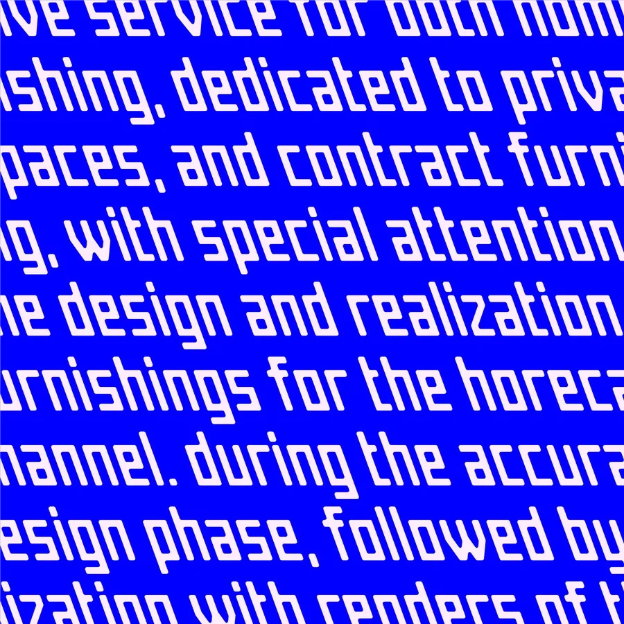
Breton is an international industrial group with sixty years of innovation and over 1,700 patents, yet their visual identity didn't reflect that legacy. With the Univisual team, I followed the full process from strategy sessions with their marketing leadership through the complete corporate identity redesign, including the design of Breton Type, a custom modular typeface rooted in rationalist typography and built on a square-module grid. The project earned an ADI Design Index selection, and looking back, it was the moment I realized I had matured into a designer who could operate across strategy, design and production at this level of complexity.
Breton is an international industrial group with sixty years of innovation and over 1,700 patents, yet their visual identity didn't reflect that legacy. With the Univisual team, I followed the full process from strategy sessions with their marketing leadership through the complete corporate identity redesign, including the design of Breton Type, a custom modular typeface rooted in rationalist typography and built on a square-module grid. The project earned an ADI Design Index selection, and looking back, it was the moment I realized I had matured into a designer who could operate across strategy, design and production at this level of complexity.

Campo Grafico, editorial design for a cultural legacy
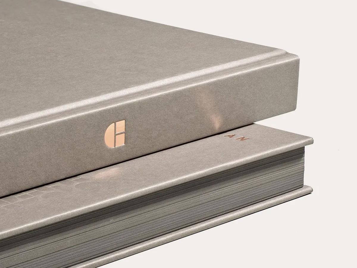
Campo Grafico was a groundbreaking Italian design journal, and Univisual was commissioned to work on a project celebrating its legacy, an assignment that connected directly to my own roots in the discipline. I co-designed the exhibition identity and a limited-edition bilingual catalog, 500 numbered copies featuring original articles, over 100 images and a fold-out poster indexing all 66 covers. The catalog earned a Red Dot Award, a Print Award and citations in specialist publications internationally, the kind of recognition that carries extra weight when the audience judging the work is the design community itself.
Campo Grafico was a groundbreaking Italian design journal, and Univisual was commissioned to work on a project celebrating its legacy, an assignment that connected directly to my own roots in the discipline. I co-designed the exhibition identity and a limited-edition bilingual catalog, 500 numbered copies featuring original articles, over 100 images and a fold-out poster indexing all 66 covers. The catalog earned a Red Dot Award, a Print Award and citations in specialist publications internationally, the kind of recognition that carries extra weight when the audience judging the work is the design community itself.
Absurd, full consumer brand identity in a competitive market
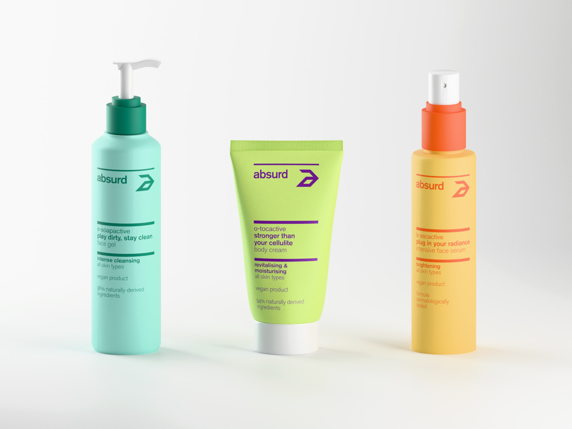
Absurd is a skincare brand I developed with the Univisual team for one of beauty's most competitive segments, against established players with decades of brand recognition. Together we owned everything from competitor analysis and brand strategy through verbal identity, visual identity and a packaging design system that had to scale across over fifty product references. The name itself is a strategic positioning statement that challenged the category's conventions and cleared trademark registers internationally. The project went from empty brief to production-ready packaging, and earned a second ADI Design Index selection.
Absurd is a skincare brand I developed with the Univisual team for one of beauty's most competitive segments, against established players with decades of brand recognition. Together we owned everything from competitor analysis and brand strategy through verbal identity, visual identity and a packaging design system that had to scale across over fifty product references. The name itself is a strategic positioning statement that challenged the category's conventions and cleared trademark registers internationally. The project went from empty brief to production-ready packaging, and earned a second ADI Design Index selection.
MON, when the client is the brand
MON is a personal brand project, and unlike corporate or consumer work, the challenge here is balancing the client's self-image with what the business actually needs. I designed an identity system that a small team could maintain independently: a streamlined typography and color system with guidelines that keep everything consistent across every digital touchpoint. The direct collaboration also gave me space to push my craft into web design in Figma, motion graphics and a dynamic logo built with 3D particle simulation. A different scale from Breton or Absurd, with the same level of ambition.
MON is a personal brand project, and unlike corporate or consumer work, the challenge here is balancing the client's self-image with what the business actually needs. I designed an identity system that a small team could maintain independently: a streamlined typography and color system with guidelines that keep everything consistent across every digital touchpoint. The direct collaboration also gave me space to push my craft into web design in Figma, motion graphics and a dynamic logo built with 3D particle simulation. A different scale from Breton or Absurd, with the same level of ambition.
Renzo, long-term brand repositioning and ongoing management
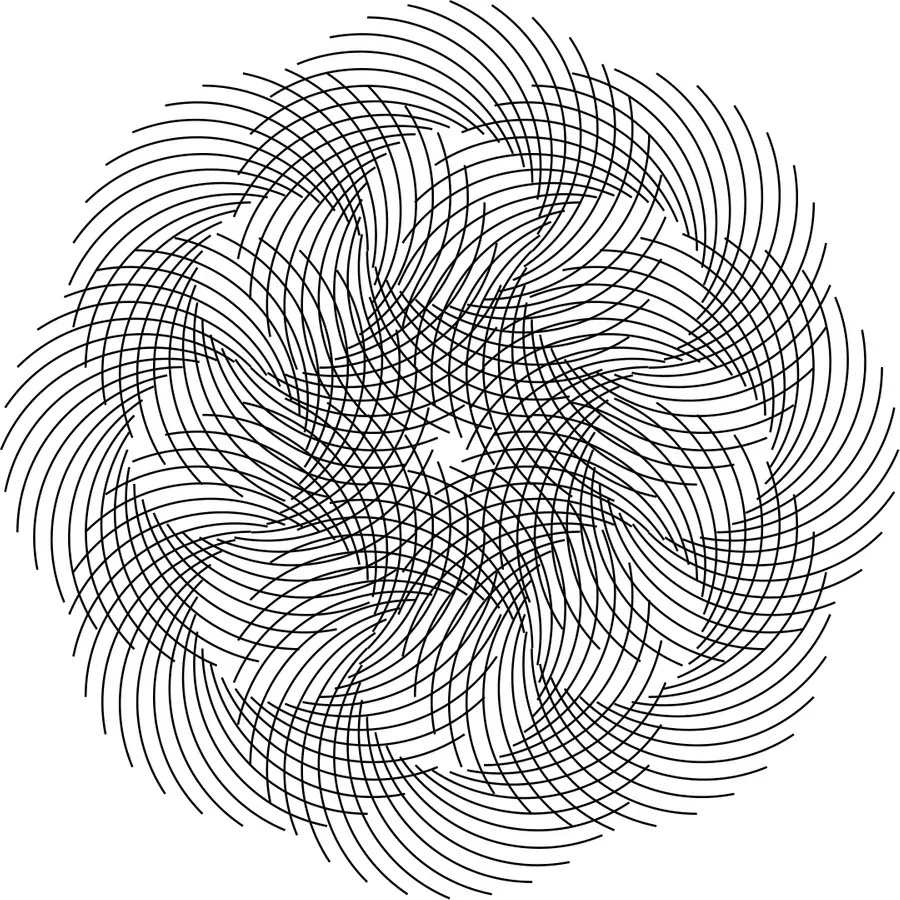
Renzo is an optical retail business I've been working with for over ten years. What started as a visual refresh evolved into a full repositioning to reach higher-value audiences in a market increasingly dominated by large chains. The scope has covered logo, color system, tagline, physical space design, retail assets, social media and digital communication. That continuity is what allowed the identity to evolve coherently, and the client is now opening a third location competing well above the original market segment. Ongoing brand management at its best means training the team on consistency, guiding every visual decision, and watching the business grow with the brand.
Renzo is an optical retail business I've been working with for over ten years. What started as a visual refresh evolved into a full repositioning to reach higher-value audiences in a market increasingly dominated by large chains. The scope has covered logo, color system, tagline, physical space design, retail assets, social media and digital communication. That continuity is what allowed the identity to evolve coherently, and the client is now opening a third location competing well above the original market segment. Ongoing brand management at its best means training the team on consistency, guiding every visual decision, and watching the business grow with the brand.
Awards and recognition beyond branding
I've received over a hundred awards and selections throughout my career at Univisual and across personal projects, and what I find most meaningful about them is where they come from. ADI Design Index is an industrial design institution, Red Dot spans product and communication design, Print Awards come from editorial, and the Italian Art Directors Club from advertising and creative direction. These aren't all the same world, and the fact that my work resonates in communities beyond branding says more about its reach than any single trophy. That range is what I bring to the table, and what I want to keep pushing forward.
I've received over a hundred awards and selections throughout my career at Univisual and across personal projects, and what I find most meaningful about them is where they come from. ADI Design Index is an industrial design institution, Red Dot spans product and communication design, Print Awards come from editorial, and the Italian Art Directors Club from advertising and creative direction. These aren't all the same world, and the fact that my work resonates in communities beyond branding says more about its reach than any single trophy. That range is what I bring to the table, and what I want to keep pushing forward.
Your next brand designer and creative director
I've spent almost twenty years going deep. Now I want to go wider. That depth gave me the rare chance to master every phase of brand development, and it made me a better strategist because I design, a better designer because I think in systems, and a better leader because I value people who challenge me. I'm ready to be challenged in new ways, in a creative culture with fresh perspectives and a pace that pushes me to keep growing. Wherever the right team is, I'll be there. Let me know if that's yours.
I've spent almost twenty years going deep. Now I want to go wider. That depth gave me the rare chance to master every phase of brand development, and it made me a better strategist because I design, a better designer because I think in systems, and a better leader because I value people who challenge me. I'm ready to be challenged in new ways, in a creative culture with fresh perspectives and a pace that pushes me to keep growing. Wherever the right team is, I'll be there. Let me know if that's yours.