25 June 2024
Innovative Tradition: A Unique Typeface Journey
Back to journal
![]()
A few years ago, I designed an identity system for a company specializing in products and services for the hospitality and restaurant industry.
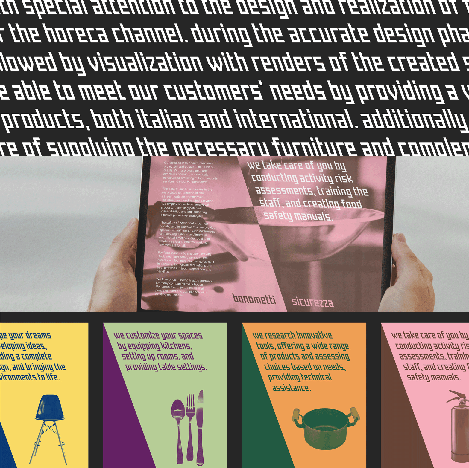
The core strategy of the project was the founder's philosophy, balancing tradition and innovation. Its visual translation was the cornerstone of the brand identity, a custom typeface with a unique slant of 20° in the opposite angle of inclination from a traditional italic font. This choice expresses the “Innovating Tradition” concept, visually highlighting a forward-looking perspective while remaining rooted in heritage.
The distinctive slant was consistently applied across the brand’s identity system, including corporate stationery, catalogs, social media templates and website development.
For a detailed breakdown of this project, please visit the full article.
Back to journal
Innovative Tradition: A Unique Typeface Journey
Back to journal

A few years ago, I designed an identity system for a company specializing in products and services for the hospitality and restaurant industry.
The core strategy of the project was the founder's philosophy, balancing tradition and innovation. Its visual translation was the cornerstone of the brand identity, a custom typeface with a unique slant of 20° in the opposite angle of inclination from a traditional italic font. This choice expresses the “Innovating Tradition” concept, visually highlighting a forward-looking perspective while remaining rooted in heritage.
The distinctive slant was consistently applied across the brand’s identity system, including corporate stationery, catalogs, social media templates and website development.
For a detailed breakdown of this project, please visit the full article.
Back to journal